Hims Web Management and E-Commerce
GIT 435/535 Web Management and E-Commerce
Arizona State University | Zuzanna Czerny 
10/15/23 - 11/17/23

Introduction
The initial step in completing this assignment involved reviewing the provided instructions and examining the examples. I meticulously noted the requirements to establish a clear understanding of the task. Subsequently, I selected Adobe XD as the prototype program due to my limited prior experience with XD. I subsequently opened XD to refresh my knowledge and download UI kits. Subsequently, I visited hims.com to analyze the processes outlined in the instructions, including site navigation and the checkout process. As I reviewed hims.com, I captured screenshots to further investigate potential areas for improvement on the website. 

Home: Current Site
Hims' home screen suggests they care a lot about selling treatments; therefore, my revamp will highlight intuitive usability for customers. 

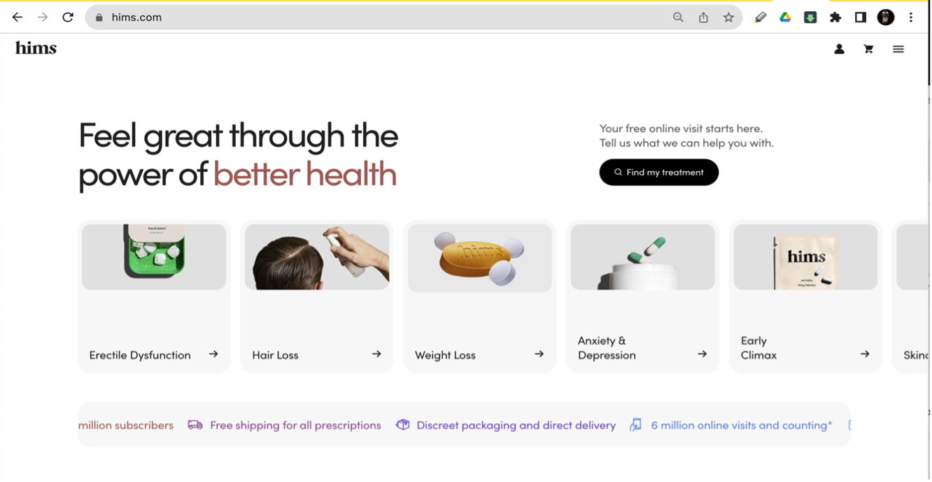
Figure 1: Screenshot of Hims home page​​​​​​​

Menu: Steps to Finding Shampoo & Conditioner
Menu > Hair Regrowth> then a long scroll to shampoo.

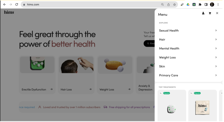
Step 1: View after pressing the menu button.

Step 2: View of Hims' hair care products at the bottom of the menu.​​​​​​​

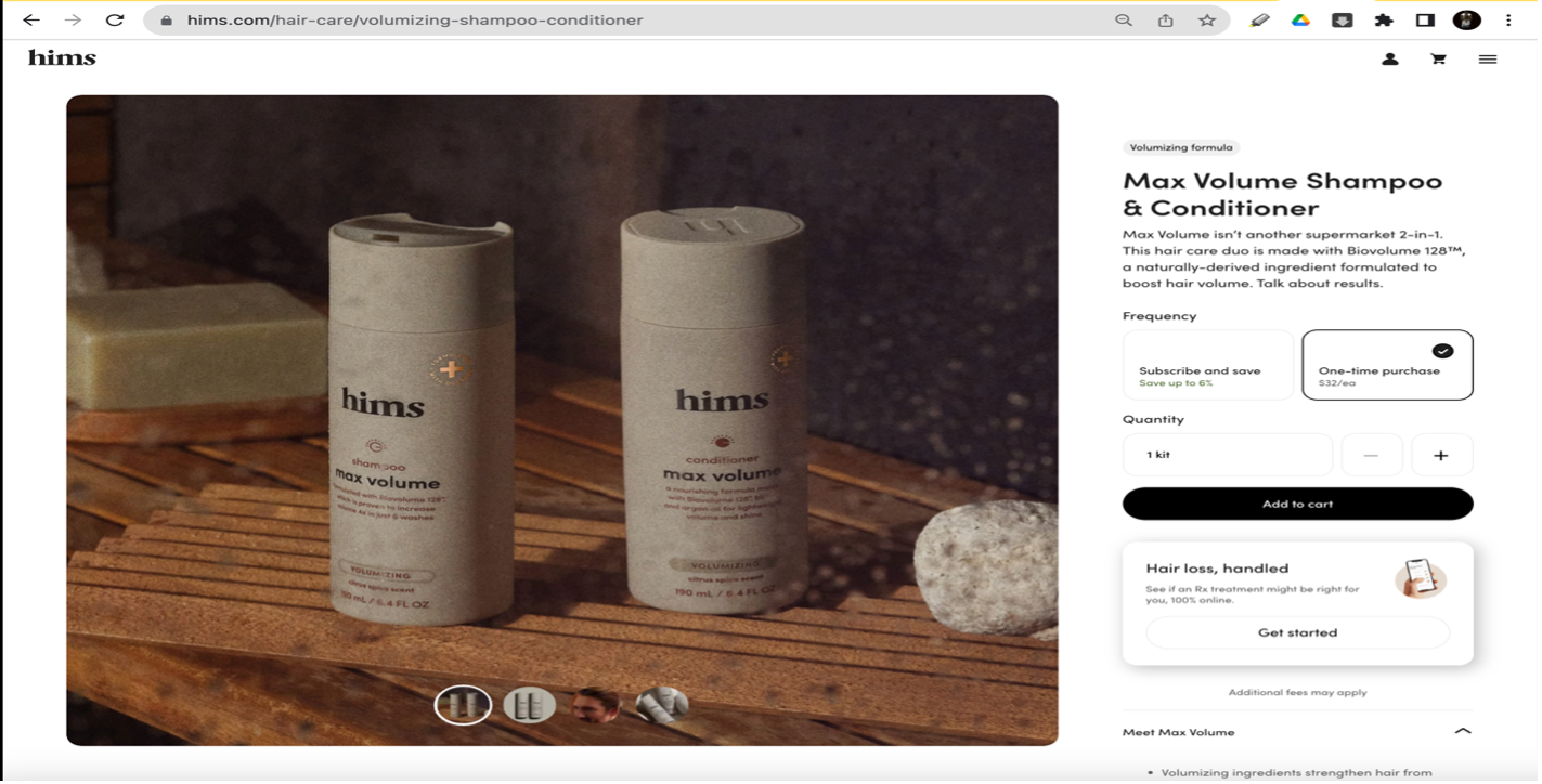
 Step 3: View after clicking Max Volume Shampoo & Conditioner.

Explanation of Issues
🛒 Many steps to check out with no option to remember users' information.
For instance: cart > enter email > enter billing info > enter payment info > confirm order.
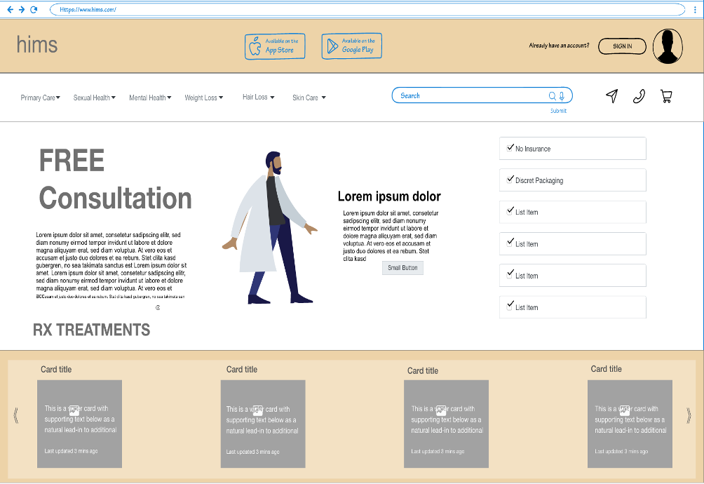
🧴Too many steps to get to products.
🛒 The cart does not indicate that there are items in the cart.
🖥️ The hamburger menu doesn't turn into a navbar on desktop
📵 This product page doesn’t have any social integrations.
💳 The site only accepts direct card payments.
The lack of social features on product pages reduces engagement and limits visibility. For example, Hims averages only three comments per Facebook post. Progressive disclosure in the checkout flow works against efficiency by breaking the process into too many small steps without options to save or autofill information. Additionally, the site only accepts direct card payments, with no third-party options like PayPal or Apple Pay, adding friction for users.
Recommendations
These enhancements aim to elevate usability and encourage continued user engagement beyond the basic fixes. Based on the refined wireframe below, these additional recommendations help reinforce usability, brand presence, and product discoverability. They build on the core fixes and support long-term user retention.
1. Add a voice-enabled search bar to the site’s navigation.
2. Add app download links at the top to boost loyalty.
3. Integrate social sharing buttons on product pages.
4. Add icons for messaging or calling Hims to support user trust.
5. Highlight free consultations with health provider images and a CTA.
6. Add a dropdown menu to access products faster.
7. Add trust devices to the home screen.
Solutions
These solutions directly address the problems identified in the analysis section.  This section outlines targeted fixes to improve friction points in the current user experience. Each solution is mapped to a specific issue to streamline the checkout process, increase visibility, and enhance user trust.
1. Suggest users sign in to enable faster checkout.
2. Allow users to save info and auto-fill during checkout.
3. Add a visual cart icon to always show item count.
4. Convert the hamburger menu to a full navbar on desktop.
5. Integrate social sharing buttons on product pages.
6. Accept third-party payments like PayPal, Apple Pay, or Google Pay.
7. Shorten the progressive disclosure to streamline checking out.
Home: Redesign Site
 Serious customers should be persuaded by this customer-focused home screen and want to log in. 

View 1: Low & high-fidelity wireframe home screen

Sign-in-Overlay: Redesign-Website
This is the initial home screen sign-in overlay, and the proceeding steps to log in aren’t in the wireframe.

View 2: Home screen login popup with social media options

Signed-in User: Redesign Site
The user is now signed into their account and uses the navbar to find shampoo.

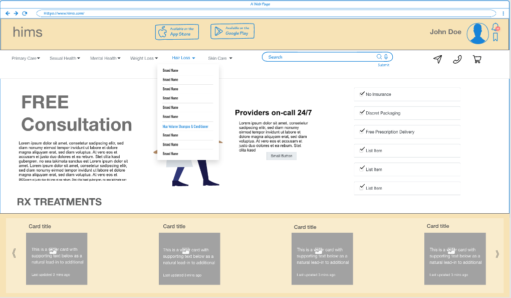
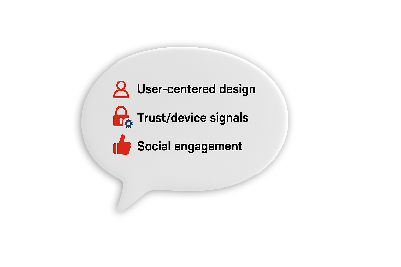
View 3: User-centered design of the Home page

Product Page: Max Volume Shampoo & Conditioner
The informed, tech-savvy user feels satisfied to add the kit to the cart.

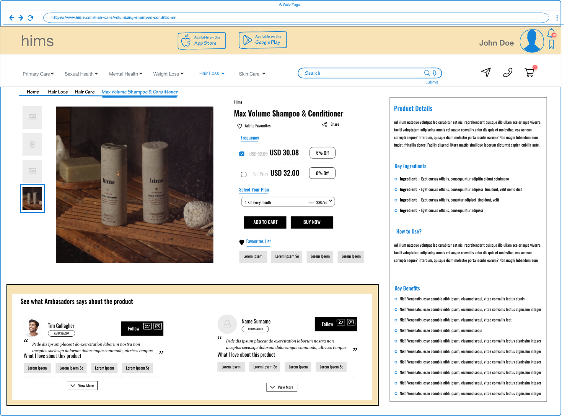
View 4: An informative focus product page that signals user priority, needs, and decision-making. 

Cart: Max Volume Shampoo & Conditioner
The share cart button and recent reviews signal to the tech-savvy customer. 

View 5: An informative focus cart page with reviews as a trust device, along with a share cart option.

Cart: Facebook Share Overlay
The informed, tech-savvy user feels inspired to share on social media before making his purchase.​​​​​​​

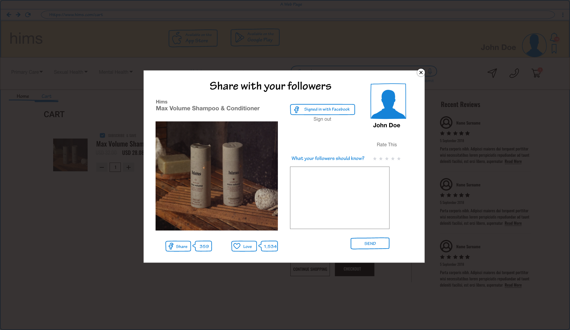
View 6: A social proof cart page that enables customers to share their purchases on Facebook through a popup overlay. 

Cart: Max Volume Shampoo & Conditioner
The customer returns to the cart after rating and sharing in the share popup, ready to check out.

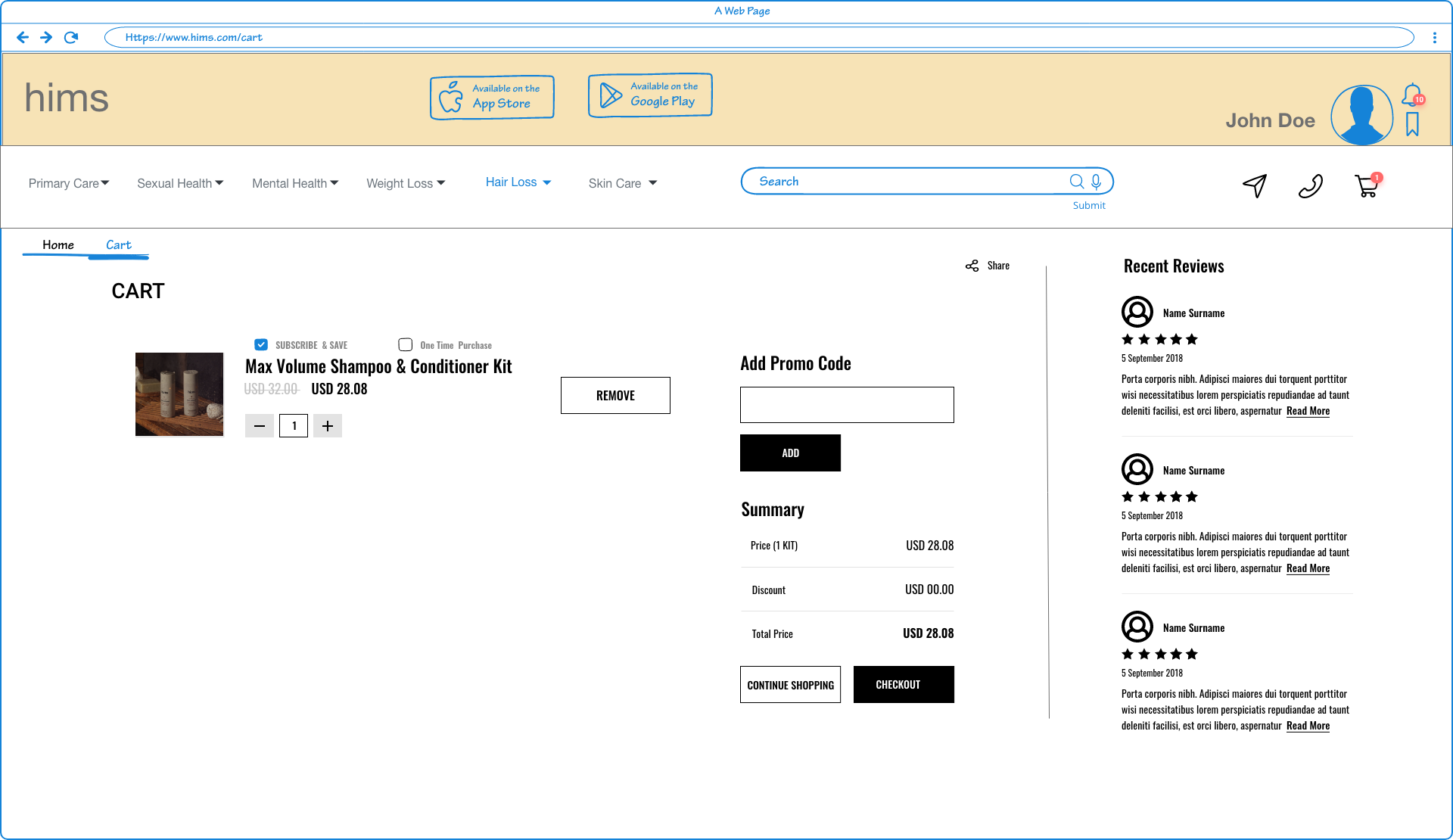
View 7: An informative focus cart page with reviews as a trust device, along with a share cart option.

Checkout Page: Max Volume Shampoo & Conditioner
The customer provides all their payment information on a single, consolidated page, thereby eliminating the current progressive disclosure checkout.

A single-page checkout experience that becomes simple after electing to remember one's information.

One-Step Checkout
🛍 Ethos (Trust & Credibility)  The inclusion of trusted third-party payment options aligns with UX best practices that emphasize credibility and trust signals, especially during payment. Additionally, giving users the ability to save their information reinforces security and convenience, positioning the brand as modern and user-centered.
❤️ Pathos (Emotional Connection)  The emotionally aligned image and quote introduce a moment of warmth and relatability during this transactional step. These emotional touchpoints appeal to users' feelings and reinforce brand personality while exemplifying a humanized experience. 
📊 Logos (Logic & Usability)  Switching from progressive disclosure to a single-page checkout streamlines the process by reducing unnecessary steps, clicks, and context-switching. According to Jakob Nielsen’s efficiency heuristic, minimizing the number of actions required to complete a task increases user satisfaction. 

Explanation: 
Comprehensive details regarding the enhancements implemented in the redesign.
Wrap up
1. Added a breadcrumb that Hims doesn’t have on its site.
2. The product category is highlighted with color in the navbar.
3. The cart-symbol number counter serves as a reminder to users to refrain from abandoning their shopping cart.
4. Humanized the checkout process with social engagement and trust devices.
5. Implemented a color-coded highlight to indicate a 0% discount on individual purchases.
6. A snippet of the customer’s favorite products serves as a trust-building and persuasive element to encourage higher spending.
7. Removed the product details, ingredients, and how-to-use dropdown menus to center the checkout page around trust.
8. Added product reviews to encourage social engagement that incorporates our social media strategy and marketing efforts.
9. Designed the home page to prioritize customer needs over sales quota objectives.
Customer Persona​​​​​​​
Journey Map​​​​​​​
Empathy Map
Multi-Channel Marketing and Social Media
🖱️ Scroll
What do they do?
Hims, an online shopping platform, actively engages with social media platforms like Facebook, Instagram, Twitter, and TikTok. While the website lacks direct product sharing buttons, visitors can easily contact Hims through links in the footer.
The checkout process lacks the “Sign in with” feature, which could’ve streamlined the purchasing process and enhanced the user experience. Hims could enhance its social media strategy by leveraging YouTube. For instance, YouTube can be a valuable platform for creating visually appealing videos showcasing new product benefits, complementing their social media campaign effectively, especially considering their tech-savvy target audience.
Hims primarily uses Facebook, Twitter, Instagram, and TikTok for social media engagement, but engagement levels may not be as anticipated. For example, TikTok posts typically receive only three comments, suggesting that the audience may not be effectively connecting with the content.
SWOT and Competitor Analysis
The competitive analysis emphasized the importance of customer-centric tactics to foster loyalty and trust, as well as the need for ongoing innovation to stay ahead of the competition. The insights from the SWOT and competitor analysis offer a road map for identifying the competitive landscape and realizing how important user experience is to pushing the boundaries of telehealth. Each platform's user-friendly layout eliminates the need for a steep learning curve, enabling consumers to quickly use the services.

An important finding of the investigation was that there is no one-size-fits-all structure for the telehealth industry. Every business targets a separate market niche with its own distinct brand image. Hims, Roman, and Lemonaid Health's visually appealing, intuitive, and user-friendly platforms provide an environment that is ideal for customer satisfaction and retention. Hims has become a modern-day advocate for men's health, providing a slick interface that makes health care more approachable. However, the analysis unveiled areas ripe for improvement, such as customer service responsiveness and broader service offerings.

On the competitive front, Roman and Lemonaid Health both mirror Hims by providing easy access to essential services. The SWOT and competitor analysis reveal intriguing insights into their operational frameworks, shedding light on their respective strengths, weaknesses, opportunities, threats, and the competitive dynamics at play. The importance of UX in telehealth is shown by Hims, Roman, and Lemonaid Health's careful design and user-centered methodologies. In addition to making healthcare more accessible, the user-friendly, eye-catching platforms help cultivate a devoted clientele—a critical commodity in the intensely competitive telehealth market.  However, the weaknesses and threats highlight the need for continuous innovation, regulatory adeptness, and robust cybersecurity measures to sustain and grow in the competitive telehealth market.

Regulatory hurdles and evolving compliance standards pose ongoing challenges. Notably, expansion into women’s health or other medical specialties could open new revenue streams. Enhancing customer service and educational resources could bolster user satisfaction and retention. Diversifying their service offerings and exploring new markets could provide substantial growth opportunities for these companies. The operations of Hims, Roman, and Lemonaid Health demonstrate the competitive nature of the telehealth sector, which highlights both the opportunities and difficulties associated with providing digital healthcare. The SWOT analysis clarifies these businesses' strategic positions and the subtle differences that make them stand out in a growing industry.

In conclusion, the SWOT and competitor analysis highlight the significance of usability and customer-centric strategies in pushing the boundaries of telehealth while also offering a detailed grasp of the competitive dynamics. My conclusions drawn provide a path through the complexity of the telehealth sector, highlighting the necessity of coordinating operations with changing consumer needs. It is simple to use, comprehend, and navigate the websites of Hims, Roman, and Lemonaid Health because of their user-focused designs. 

 Because all three platforms have an easy-to-use interface, users can quickly get the services they need without having to go through a steep learning curve. By providing both an aesthetically pleasant experience and an easily navigable interface, these platforms have effectively combined aesthetics and functionality. This has lowered barriers to healthcare access and increased user happiness.

My Recommendations

Use YouTube

YouTube can effectively display the benefits of the Patchy Beard 
Hair Growth Kit. Customer testimonials and how-to videos are 
likely to outperform static images.

Engagement Strategies

Hims should create more dynamic, interactive content to grow
 visibility on social media. Campaigns like challenges or contests 
can encourage user participation. 


Audience Segmentation
Tailor content to fit each platform’s unique audience and preferences.
Not all formats perform equally well on TikTok, Facebook, or Twitter.
Customized strategies will improve reach and engagement.
Consistency
A steady posting schedule builds trust and keeps users engaged.
Frequent, reliable content boosts loyalty and brand awareness.
Consistency helps develop a devoted following.


User-Generated Content

Customers should be encouraged to share their success stories. 
The user-generated content will feel relatable and help build
brand authenticity, credibility, and reach.

Analyze Data

Use social media analytics to track what content performs best. 
Refine future campaigns based on user engagement and trends. 
This ensures content remains relevant and effective.

Summary

Hims lacks visible social integration despite active social channels.
A share button on product pages could drive traffic and visibility.
This change supports their broader digital marketing goals.

Final Note

Adding YouTube strengthens both visibility and user connection.
Video platforms help humanize the brand and expand its reach.
Organic content performs well without seeming overly promotional.


What did I learn? 
Beyond technical skills, this project reinforced how human-centered design isn't just a concept. It's a process that requires thinking ahead, predicting struggles, and proactively solving them through thoughtful interaction design and marketing.
Back to Top