

Introduction | Hi-Fi Wireframes | Analysis | Solutions | Design Decisions | Project Brief | Persona | Empathy Map | Storyboard
Introduction
This project showcases a comprehensive redesign of the Philly Auto website, undertaken as part of the GIT 480 Senior Project, focusing on enhancing user experience (UX) and implementing effective marketing strategies to drive customer engagement and satisfaction. Drawing from my background in web development and digital marketing, I aimed to create a user-centric online platform for Philly Auto that reflects their brand and meets the needs of their target audience.
The redesign addresses key issues such as lack of transparency, outdated design, and poor user experience by implementing user-centered design principles, SEO strategies, and a customer-first marketing approach. This project demonstrates a practical application of design thinking, from initial research to a fully developed prototype for desktop, tablet, and mobile. The project's goal is to improve the online presence of a local car dealership and make the car buying process more transparent and customer-friendly.
The redesign addresses key issues such as lack of transparency, outdated design, and poor user experience by implementing user-centered design principles, SEO strategies, and a customer-first marketing approach. This project demonstrates a practical application of design thinking, from initial research to a fully developed prototype for desktop, tablet, and mobile. The project's goal is to improve the online presence of a local car dealership and make the car buying process more transparent and customer-friendly.
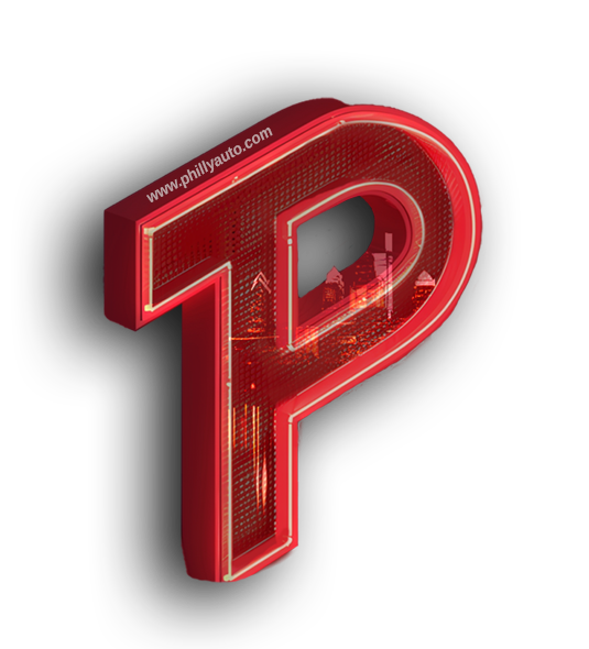
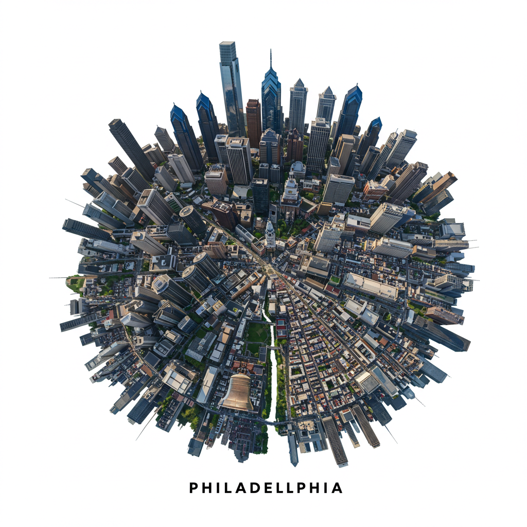
Logo redesign made in Photoshop.
Philly Auto Hi-Fi Wireframes w/ Video
This redesigned logo that features the Philadelphia skyline is made for brand awareness and Philly pride.
Desktop Wireframe w/ Video
This wireframe demonstrates the first six touch points and displays their supporting assets.
The video shows each interaction in action, with its matching UI components displayed around it.
🖱️ Scroll to explore the full layout
Wireframe Features
View the following interactions:
👀 Visual Demo: Desktop redesign
🖱️ Hover: Social media pop-ups
👆 Click: Recent reviews expansion
⌨️ Typing: Search bar conditional logic
🔁 Toggle: Hamburger menu prototype
👁️ View: Redesigned logo
Tablet Wireframes w/ Video
This wireframe demonstrates five new touchpoints and displays their supporting assets.
The video shows each interaction in action, with its matching UI components displayed around it.
🖱️ Scroll to explore the full layout
Wireframe Features
View the following interactions:
👀 Visual Demo: Redesign Video
🔘 Tap/Swipe: Car specials carousel
🖱️ Hover: Dropdown menu
↕️ Scroll: Sticky Navbar behavior
🖱️ Mouse/Tap: 360° vehicle viewer (enter or click)
Phone Wireframes w/ Video
This wireframe demonstrates five new touchpoints and displays their supporting assets.
The video shows each interaction in action, with its matching UI components displayed around it.
🖱️ Scroll to explore the full layout
Wireframe Features
View the following interactions:
👀 Visual Demo: Tablet redesign
👆 Click: Hamburger menu
🖱️ Hover: Hours of Operation
🔘 Tap: Business popups
↕️ Scroll: Incentives cards

Original Web Analysis
This analysis of the original website’s UX/UI flaws was through the lens of visceral, behavioral, and reflective design. Each slide exposes critical issues such as information overload, poor color contrast, manipulative navigation, and broken trust signals. My analysis highlights how these missteps create friction, dilute credibility (ethos), and fail to inspire user action (pathos).

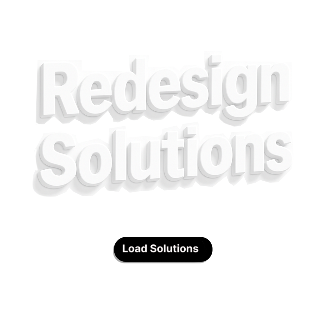
Redesign Solutions
The redesign transforms the website into a human-centered experience with aspirational visuals, intuitive interactions, and emotional resonance. Slides demonstrate how strategic imagery (pathos), layered information (logos), and warm, action-driven colors (behavioral) rebuild trust and guide users seamlessly across devices to make aesthetics and functionality coexist.
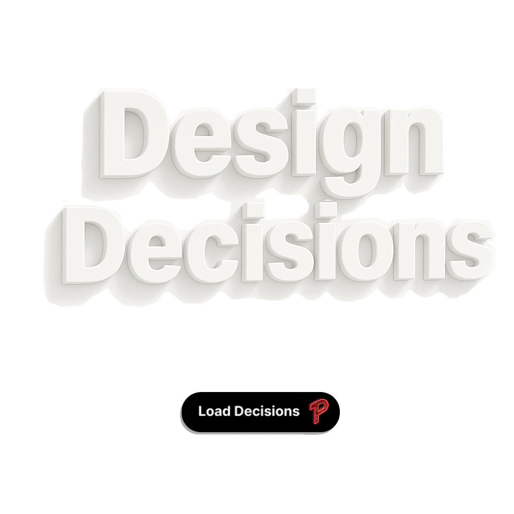
Design Process
The design process focused on solving real user problems through thoughtful research, planning, and iteration. Starting with competitive analysis and user insights, we defined clear goals that balanced business objectives with user needs. Tools like Figma and Adobe helped visualize ideas, while feedback and testing shaped decisions at every stage. Each phase, from sketches to code, was informed by strategy, from building trust with layout choices to enhancing usability through accessibility and personalization
Project Brief
The project brief established a clear vision for solving user problems through strategic design and research. By identifying gaps in transparency, usability, and visual consistency, we set out to create a modern, trustworthy platform that aligns with Philly Auto’s brand. This foundation shaped our goals around accessibility, online purchasing, and trust-building content. Understanding the business objectives and user needs early on allowed every design choice to be intentional and measurable, ensuring the experience we built would serve both users and the dealership with clarity, confidence, and purpose.

Customer Persona
Customer Persona
Creating a detailed persona helped us identify our ideal customer and better understand her needs, goals, and frustrations. Vanessa represents a modern car shopper who values luxury, trust, and convenience but struggles with time and decision fatigue. By defining her lifestyle and preferences, we were able to design an experience that anticipates her pain points and removes friction. This clarity allowed us to align usability with emotional impact, ensuring every interaction feels thoughtful, personal, and memorable.
Empathy Map
The empathy map was a key part of our research phase and helped guide design thinking by capturing real user motivations, pain points, and behaviors. It allowed us to humanize our data and understand what customers like Vanessa need to feel confident when shopping for a car. Her concerns about trust, financing, and information overload shaped how we prioritized content, simplified features, and built transparency into the layout. This tool helped us stay user-focused and ensured the redesign solved real problems with empathy and clarity.


Storyboard
The redesigned storyboard focuses on usability and functionality, introducing multiple interactive overlays and clearly structured touchpoints to enhance the user experience. Key forms like loan applications, quotes, and pre-approvals are placed upfront to support quick access without leaving the homepage. The layout uses persuasive visual hierarchy, organizing incentives, reviews, and weekly specials in a way that builds trust. Icons and tooltips guide user actions and every section, from calculators to browsing inventory, is designed to be intuitive and action-oriented, helping users make decisions faster and with more confidence.
Research & UCD
Research and planning laid the foundation for the redesign, focusing on user needs and behaviors through tools like Google Keyword Planner and Trends. By identifying what potential customers searched for, we created a persona named “Vanessa” and an empathy map to better understand her thoughts, feelings, and actions. This human-centered approach aligned user insights with business goals, guiding the development of a more effective and user-friendly design. This strategic approach ensured the design process was rooted in a clear understanding of both the users and the business goals, leading to the development of key design assets.

Key Issues Analysis
The Philly Auto website faced several key issues that impacted usability and brand perception. The layout was cluttered with excessive text and inconsistent visuals. The navigation was outdated, and essential elements like sorting buttons in the hero image were not intuitive. The site also lacked transparency in pricing, with unclear payment estimates and missing tools such as a reliable search function or full online purchasing options. These gaps, along with the absence of trust signals like reviews, warranties, and Carfax, weakened the overall customer experience. These problems highlighted the urgent need for a modern and user-centered redesign.
What did I learn?
The current Philly Auto website suffers from several key issues that hinder user experience and do not effectively represent the brand. The site is visually cluttered and overwhelming with excessive text and inconsistent design elements, making it difficult for users to focus on important information.
The current Philly Auto website suffers from several key issues that hinder user experience and do not effectively represent the brand. The site is visually cluttered and overwhelming with excessive text and inconsistent design elements, making it difficult for users to focus on important information.