

Introduction | Product Design | Snapshot | Wireframe | Customer Persona | Content Strategy | Website Analysis | Style Guide
Introduction
This UX/UI web analysis of Poppin Joe’s website is based on the June 8, 2019, archive via the Wayback Machine. It evaluates the clarity, effectiveness, and usability of the website’s written content, alongside its design and functionality. In this analysis, I examined key writing principles such as tone consistency, audience engagement, and rhetorical effectiveness, while also assessing how content structure influences usability.
The evaluation focuses on design consistency, content strategy, site navigation, and accessibility, ensuring that the website meets user expectations and reflects brand identity. Key areas of emphasis include streamlining navigation for easier information retrieval, enhancing readability through improved content structure, and balancing storytelling with product promotion to build user trust and engagement. By utilizing rhetorical analysis, usability heuristics, and best practices in digital media writing, this project illustrates how strategic content and UX enhancements contribute to a more effective and user-friendly web experience.
Product Design
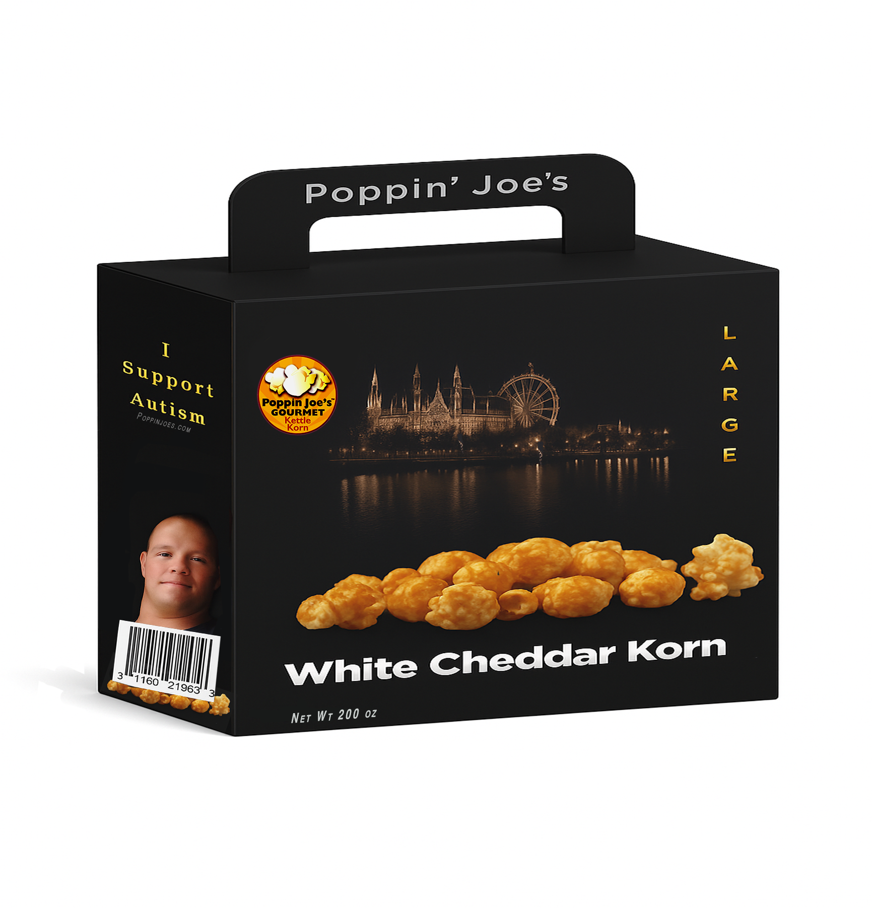
We strengthen their brand perception through packaging.

Key Design Insights
⚫️ The circular logo aligns visually with the carnival wheel to create spatial harmony, using proximity and shape association as a UX design principle.
⚫️ The carnival scene symbolizes the brand’s real-world business model, which centers on state fairs, festivals, and in-person events.
⚫️ Featuring Joe on the side of the box shifts the brand narrative from centering his condition to highlighting him within a broader business-first identity.
⚫️ The “I Support Autism” message doubles as a slogan for the buyer, promoting empathy without making disability the business model.
⚫️ Poppin’ Joe’s” is placed on the handle, separating brand identity from product storytelling on the front panel.
⚫️ The box corrects the disconnect between the brand’s heartfelt mission and its previous lack of market readiness, adding aesthetic professionalism and shelf appeal.
⚫️ It serves as a visual anchor for the redesigned website and reflects the unified tone established in the full UX audit.

Current Website Snapshot
Navigate the original website structure in this prototype.
Noticeable Website Issues
Sympathy-First Messaging: The site positioned Joe’s personal story as the central focus, relying on emotional appeal rather than a clear business model or product-first narrative.
Weak Visual Hierarchy: Logos, text, and graphics were not clearly structured, leading to a cluttered and unfocused user experience.
Poor Text Accessibility: Several areas had low contrast between text and background, making content hard to read and failing basic accessibility guidelines.
Lack of Trust Signals: No visible elements like product barcodes, reviews, secure checkout indicators, or support details to build user confidence.
Minimal Product Focus: The popcorn and its unique value were underrepresented, with little storytelling around flavor or customer appeal.
Inconsistent Visual Layout: Mismatched image sizes and a poorly functioning image carousel, disrupting visual flow and making the browsing experience feel unpolished.
Inconsistent Branding: The visuals and messaging didn’t align with professional food brands, creating a disconnect between mission and market appeal.

Redesign Website - Lo-Fidelity Wireframe
View the wireframe redesign in this prototype.
Lo-Fidelity Wireframe Overview
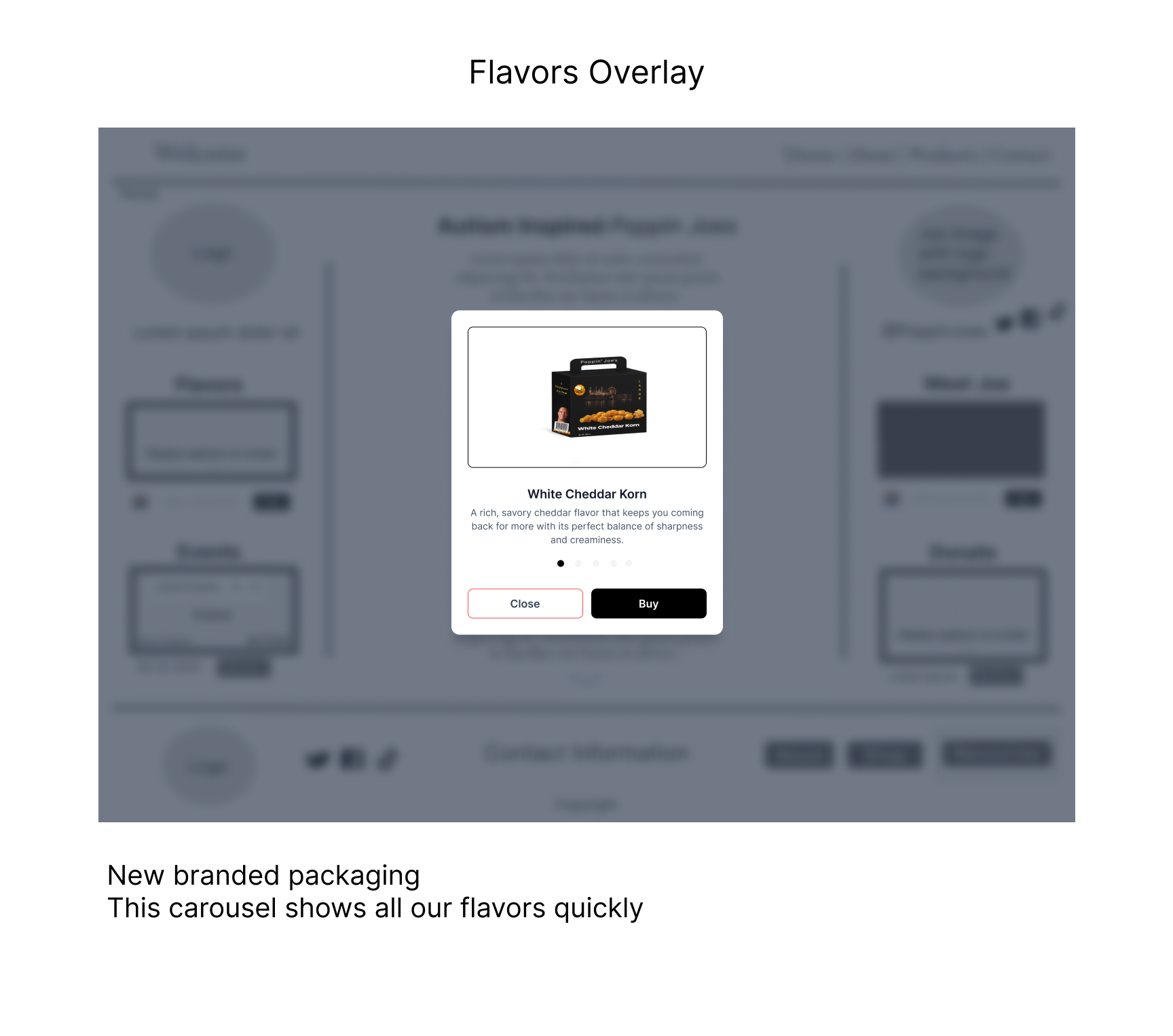
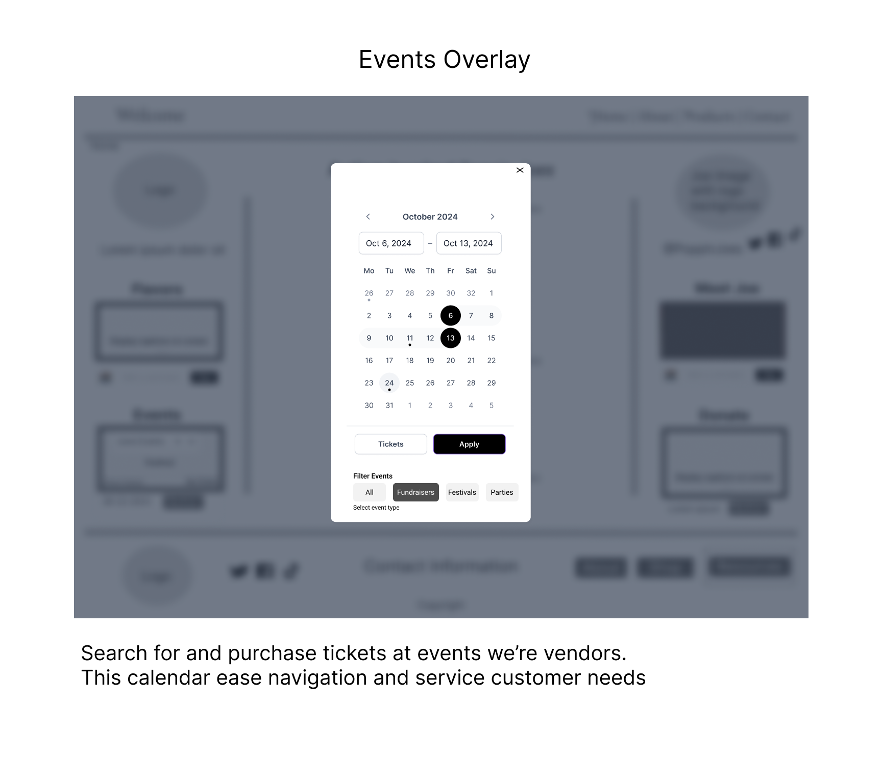
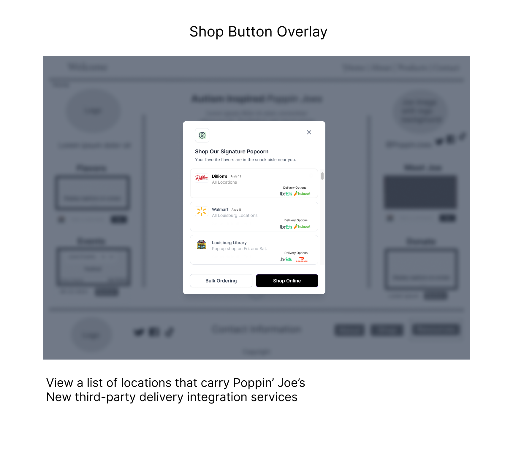
This homepage wireframe applies user-centered design by balancing brand storytelling with task efficiency. The original site’s centered layout is retained but enhanced with interactive sidebars that provide quick access to flavors, events, donations, and media.
Left Sidebar: Product-focused with a flavor carousel, event calendar, and quick ticket links.
Right Sidebar: Story-driven, featuring Joe’s image, social media, videos, and donation options.
All sidebar components are persistent across all pages, providing consistent access to core functions. The central section uses progressive disclosure to streamline content into scannable touchpoints and minimize cognitive load. The hi-fi wireframe will reveal the true white space and layout balance.

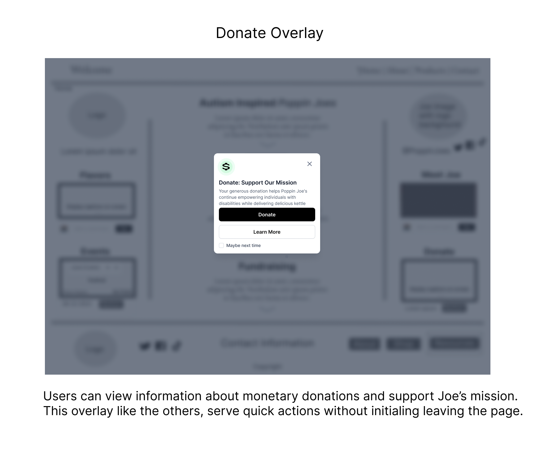
Redesign Overlay Pop-ups
Created with Figma, MidJourney & Adobe Photoshop.


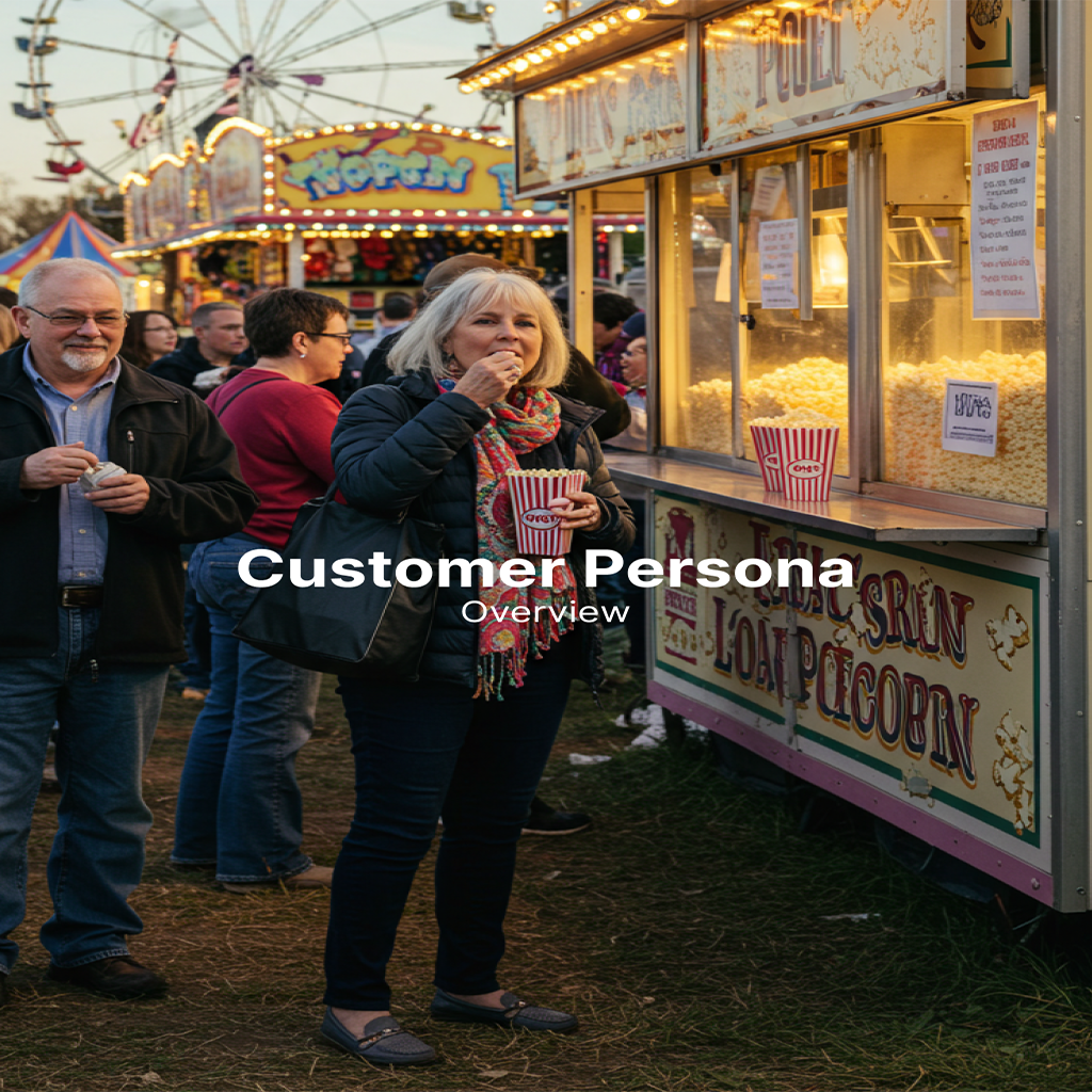
Customer Persona
Created with Lucidchart, MidJourney & Adobe Photoshop.


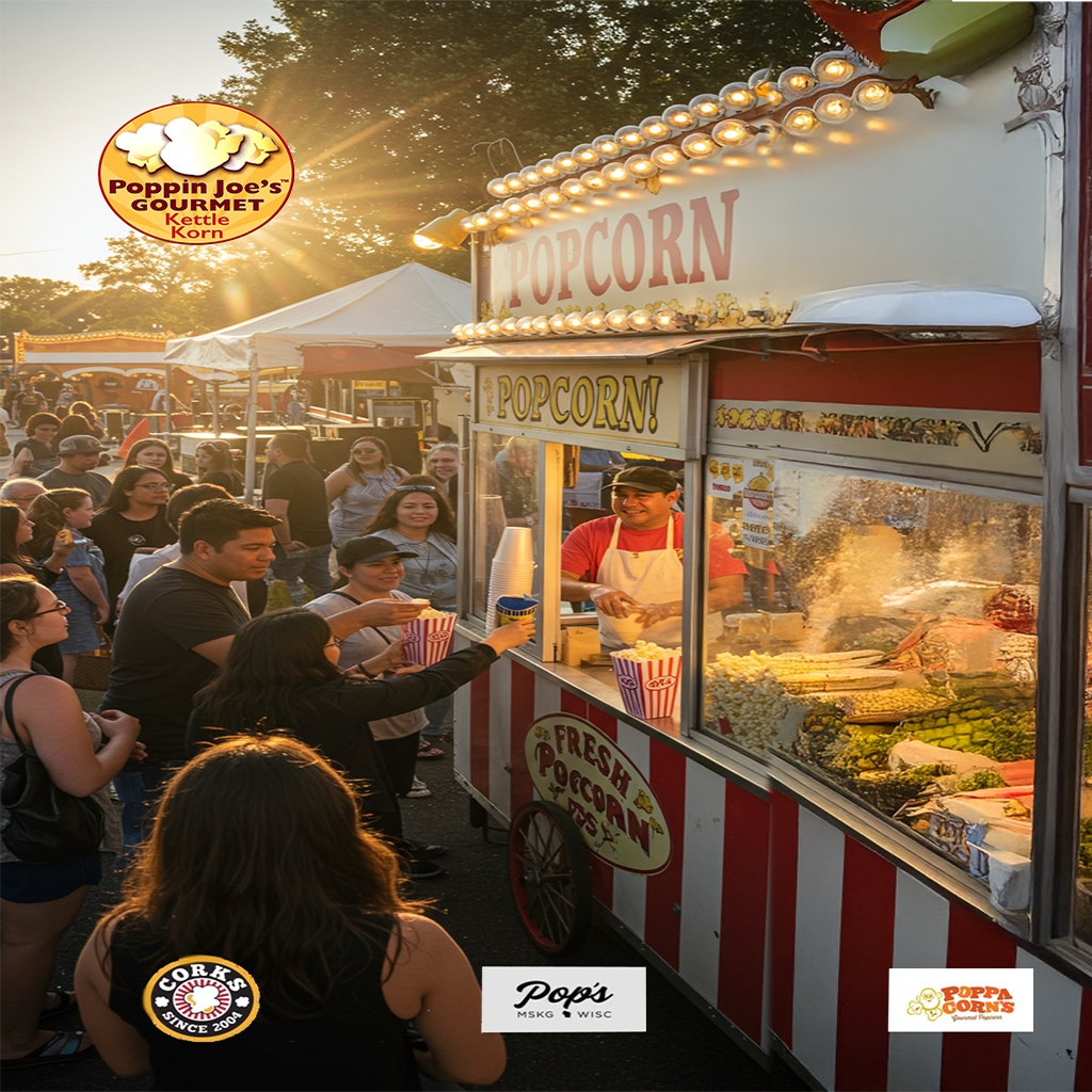
Content Strategy
Created with Microsoft Word, Google ImageFX, and Adobe Photoshop.


Website Analysis
Created with Figma, Microsoft Word, Adobe Photoshop & Chrome Dev Tools.


Style Guide
Created with MidJourney, Google ImageFX, Adobe Photoshop, and Microsoft Word.


What did I learn?
Beyond technical evaluation, this project reinforced how content strategy and UX writing shape user perception, demonstrating that effective web design isn’t just about visuals but also about crafting clear, engaging, and accessible messaging.